


COMMUNICATION
CAIXA ONTINYENT
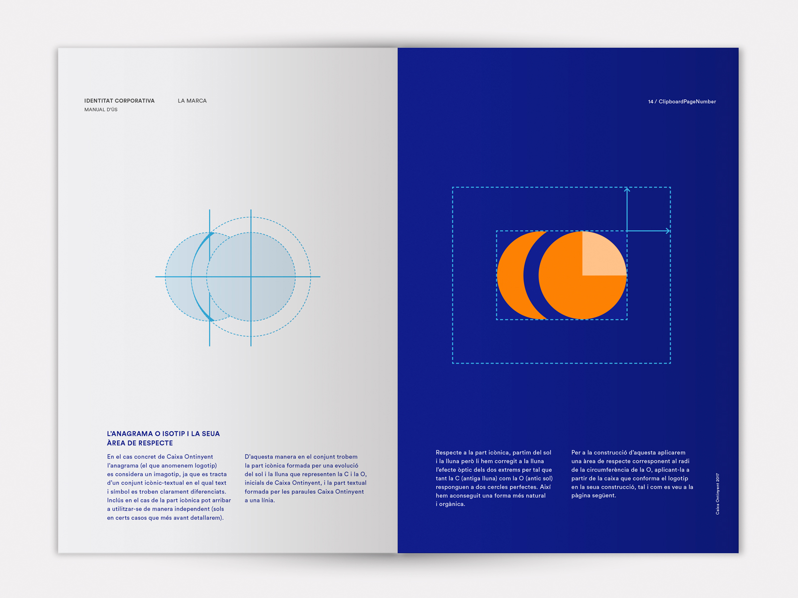
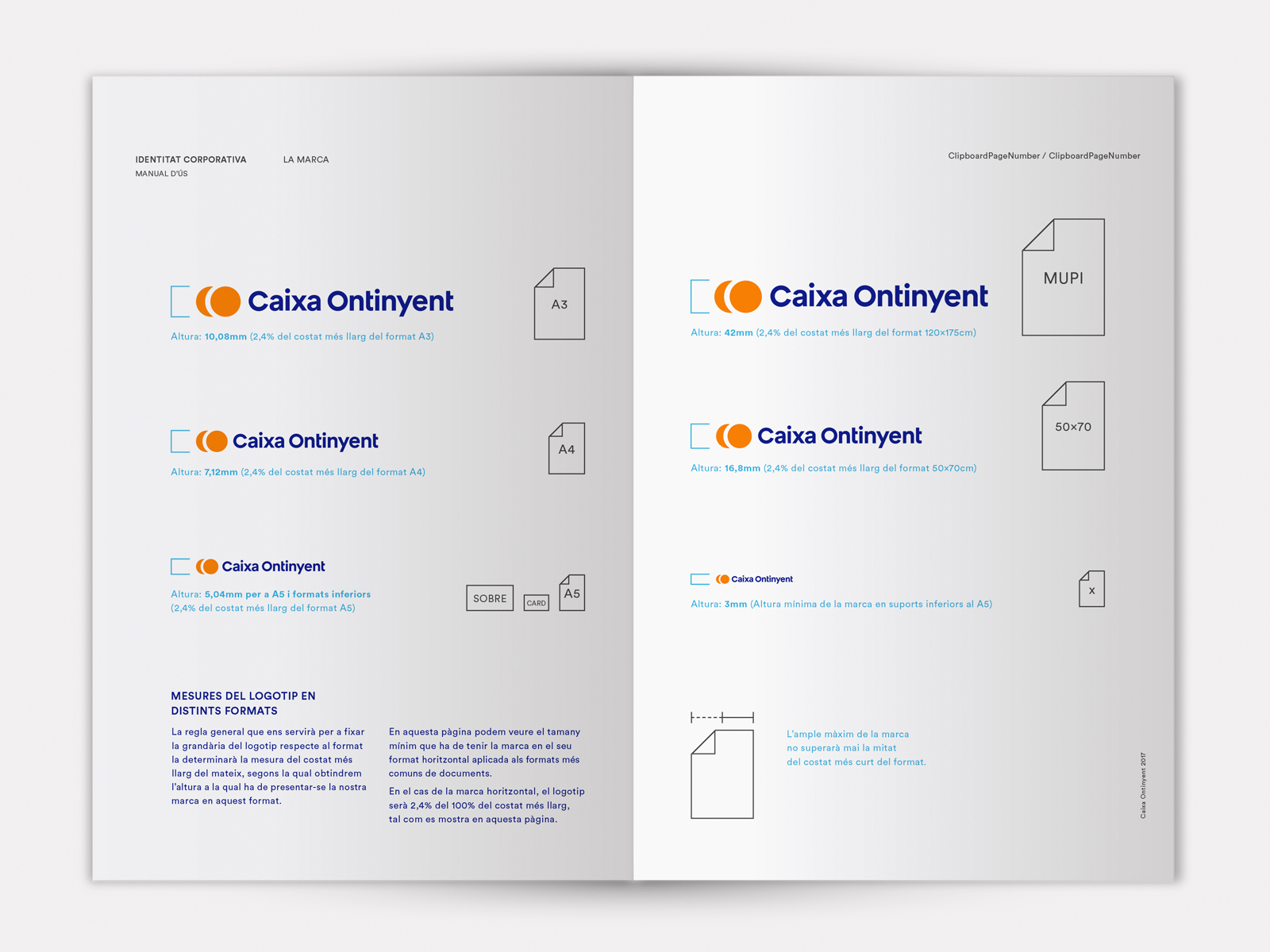
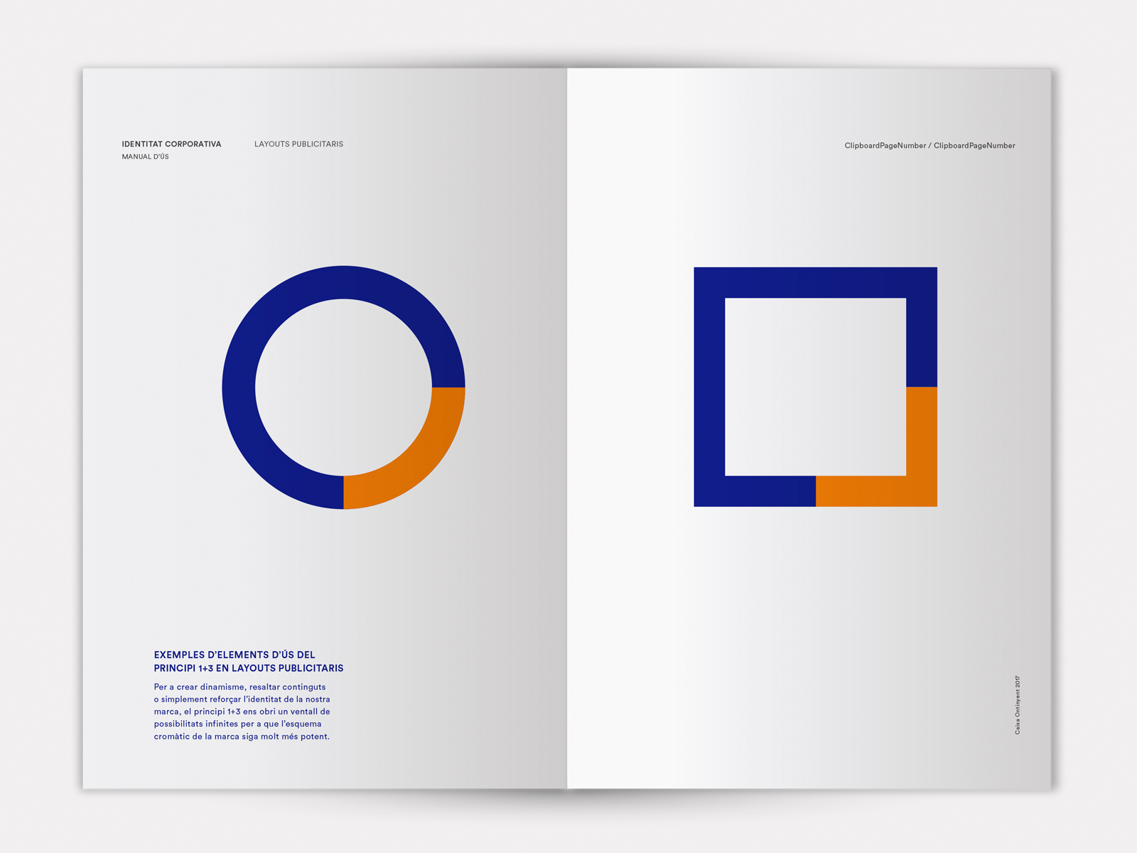
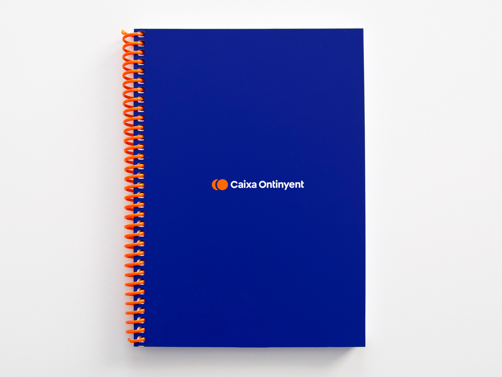
The new corporate identity of Caixa Ontinyent is a restyling of the previous version, refining its shapes, font and colour to update it and bring it closer to its target.
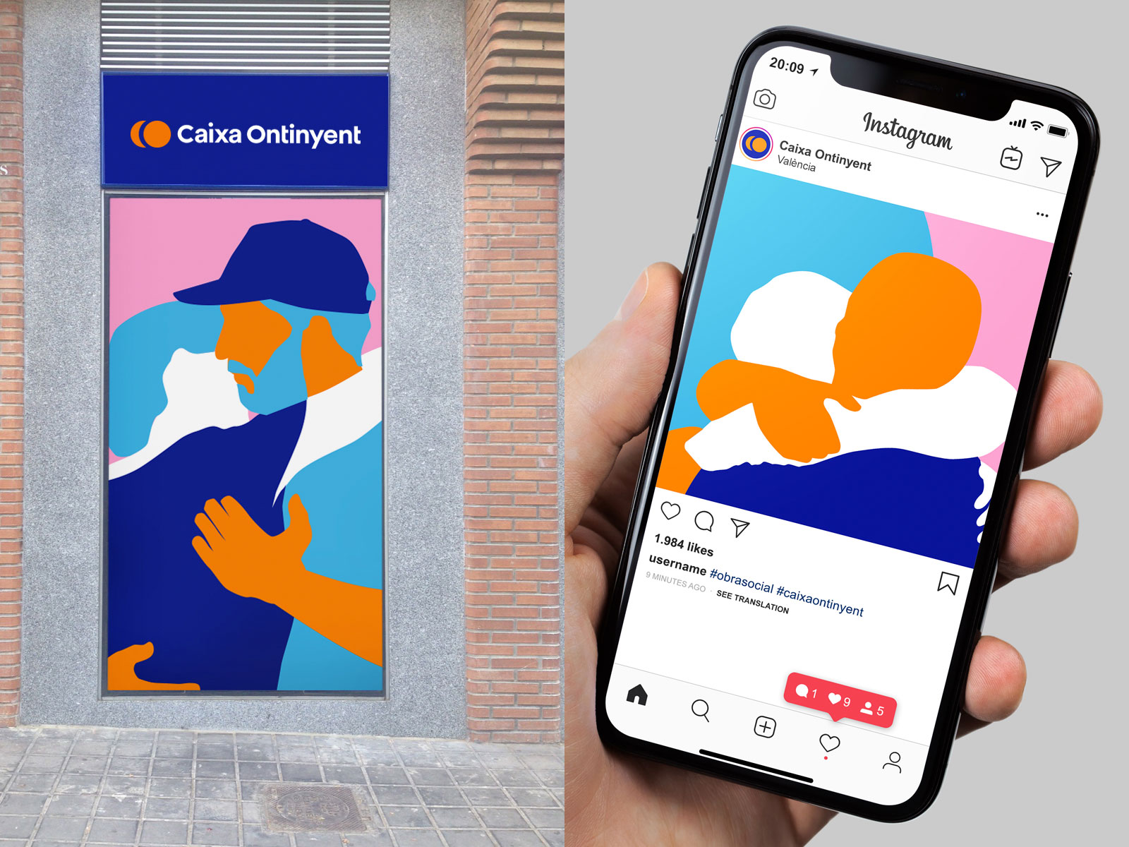
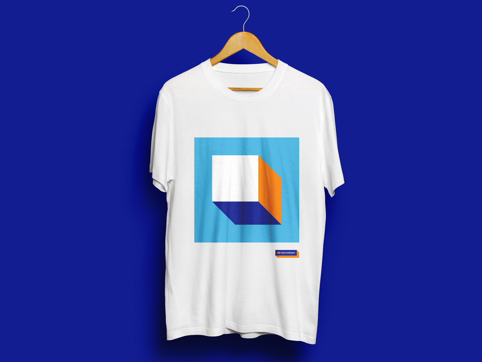
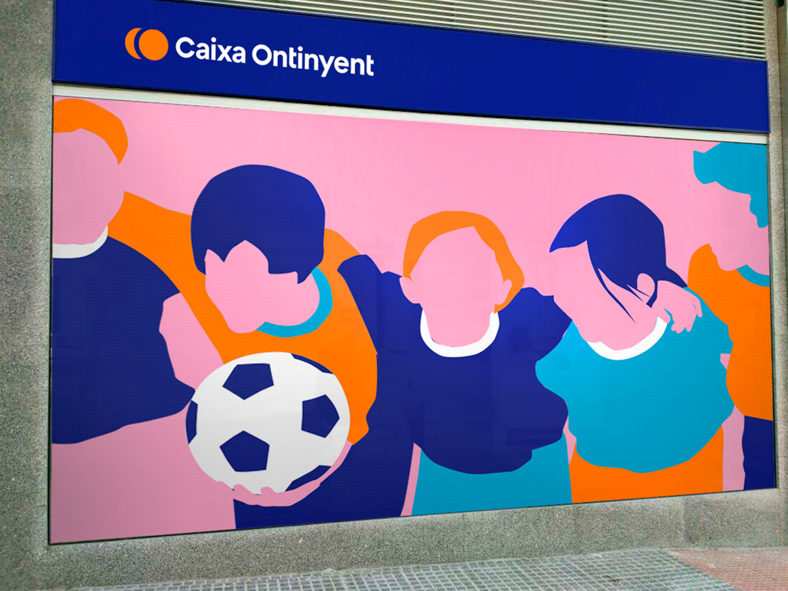
The new identity represents a new phase for the entity where is seeks to open up to a broader audience without losing proximity, in line with its philosophy of territorial roots. The brand symbol was polished to represent the entity’s initials, while the design as a whole gained proximity with its colour combo and changing to a new, lower case font.
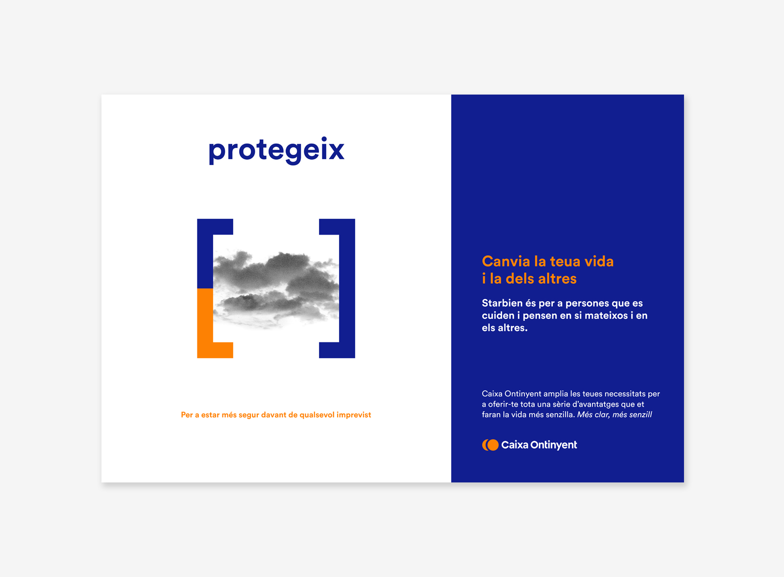
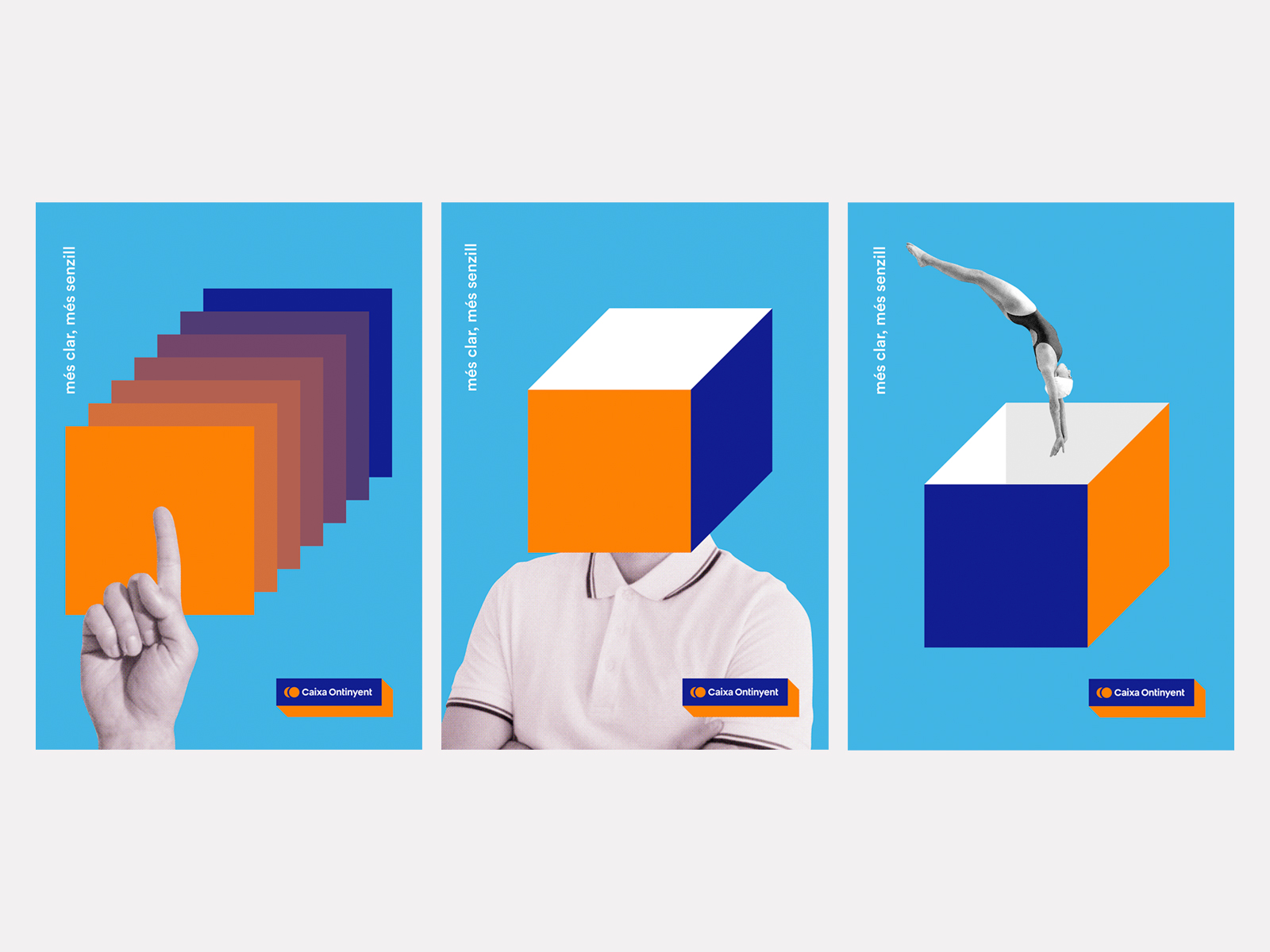
The new identity is also seen in communications such as the corporate campaign ‘Més clar, més senzill’ (‘Clearer, simpler’) by Caixa Ontinyent, which aims to convey the ease and extension of its services. Or the young campaign ‘Encaixa’ (‘Fit in’), part of the corporate campaign “Més clar, més senzill”, seeking to bring a younger target to the entity.
Year: 2017 & 2018
Client: Caixa Ontinyent
Sector: Banking
Direction: Democràcia®
Art direction: Javier Tortosa
Design: Javier Tortosa, Migue Martí, Chavo Roldán
Copy: Marta Tortosa, Pablo Llobell
Skills: Logo, restyling, corporate identity, corporate identity dossier, storytelling, miscellaneous, campaigns, advertising