IDENTITY DESIGN
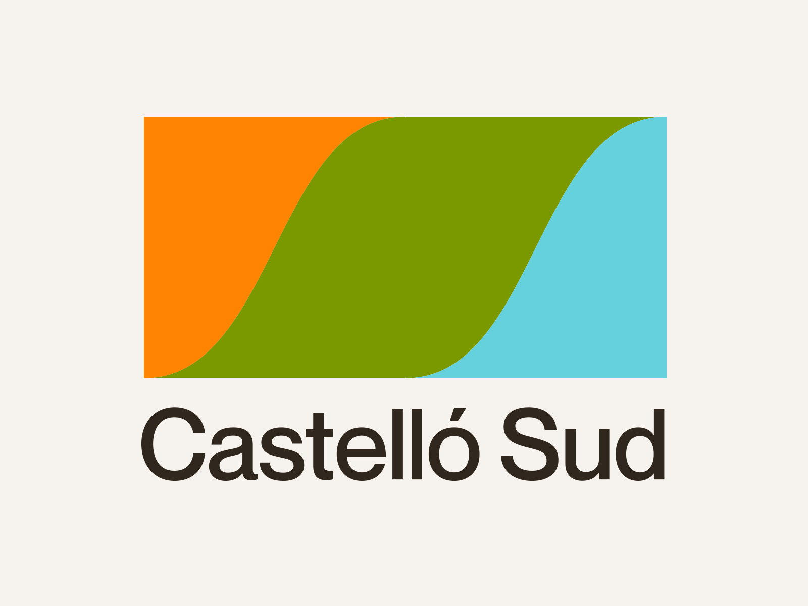
CASTELLÓ SUD
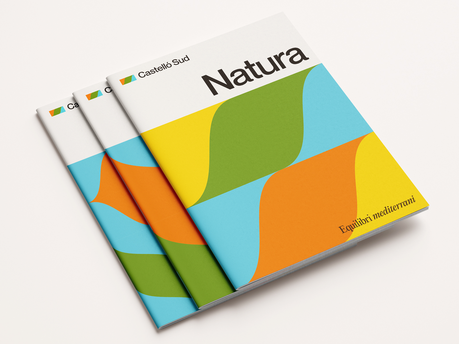
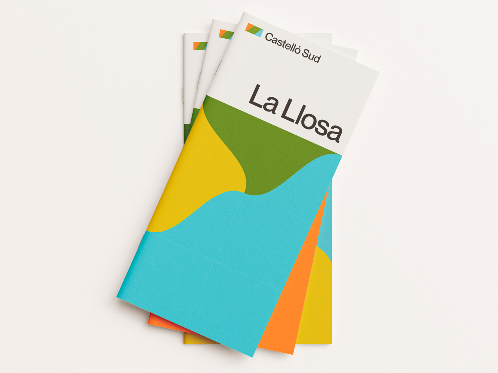
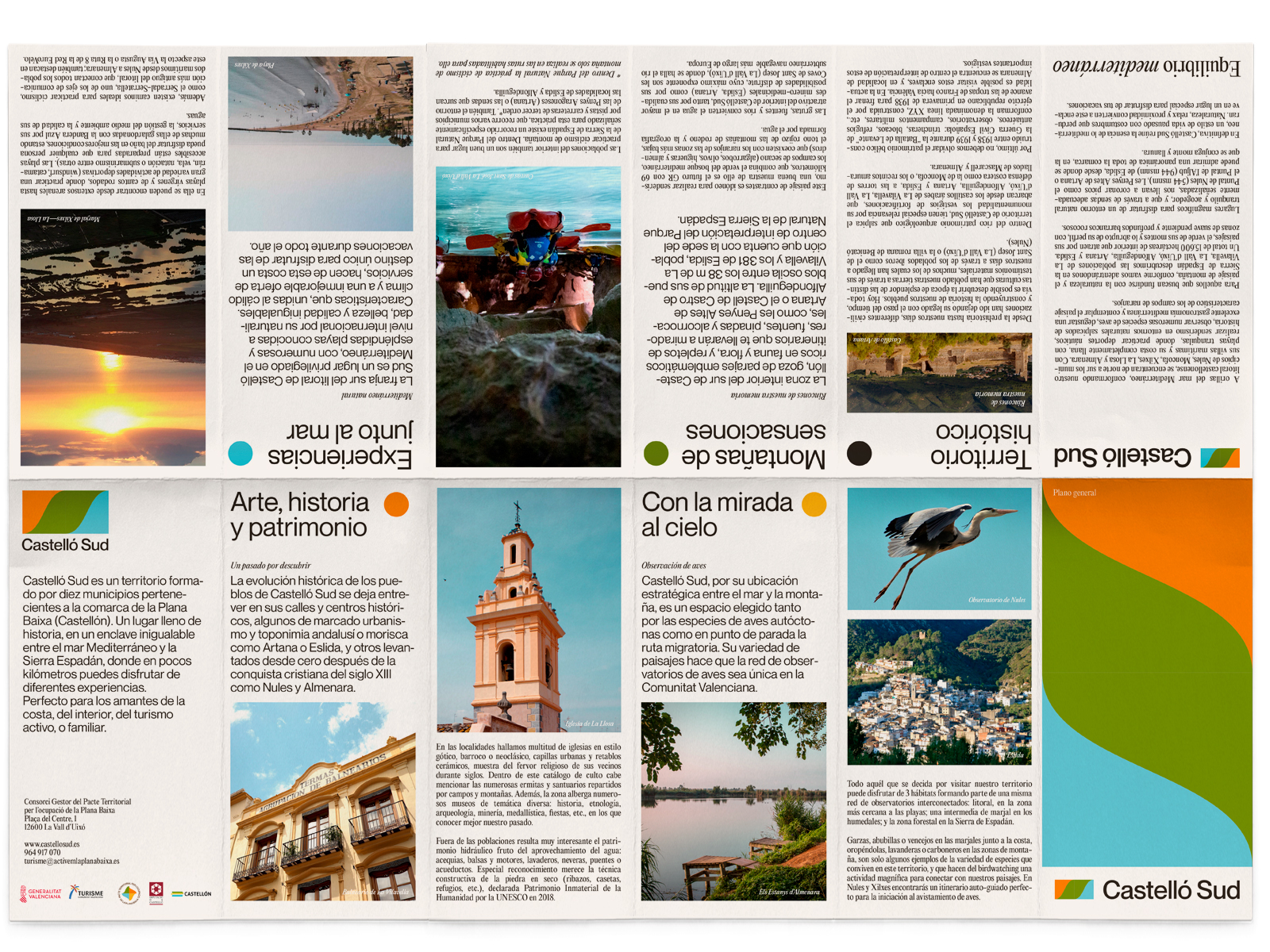
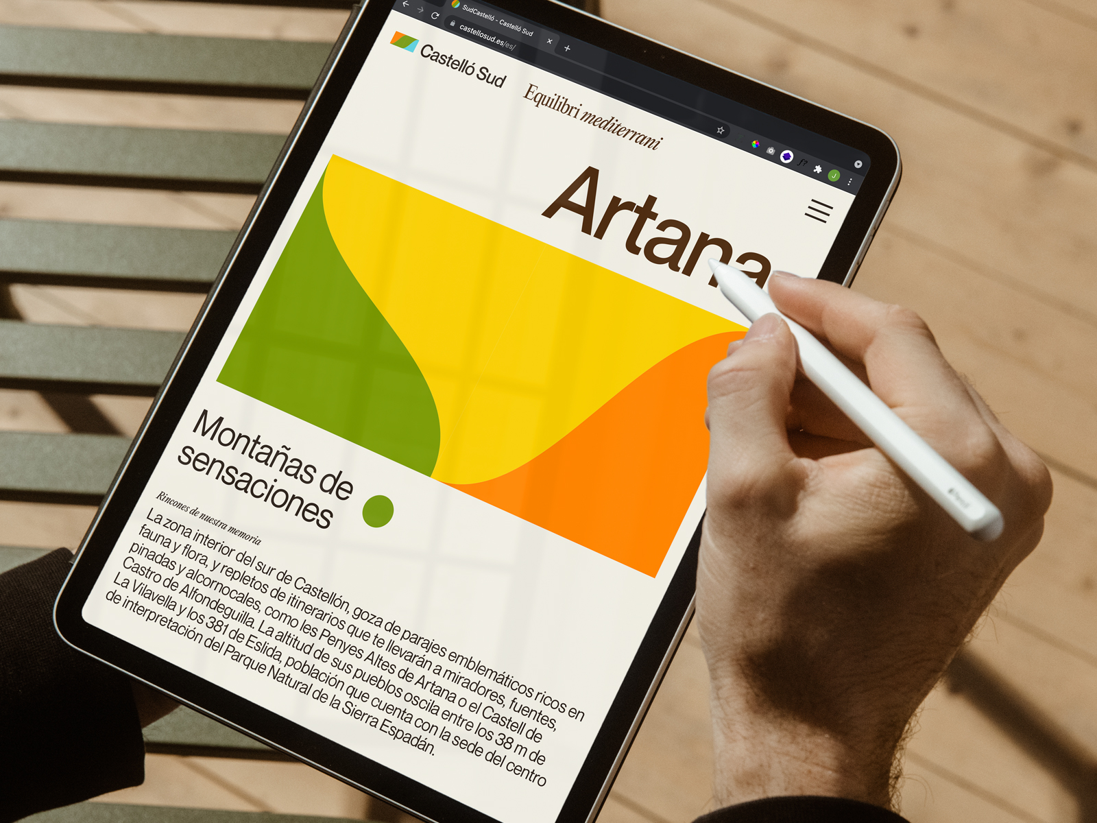
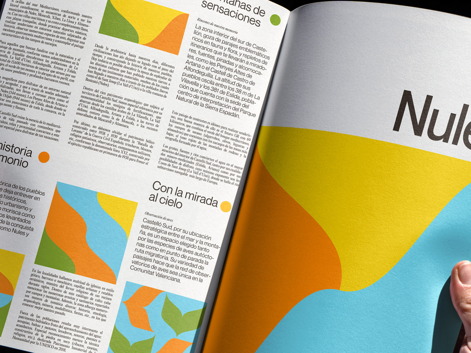
The south of mediterranean Castellon tourist offering comprises an extensive proposal from the architectural heritage to the nature and the sea. The brand has to be able to reflect all this in an integrated way.
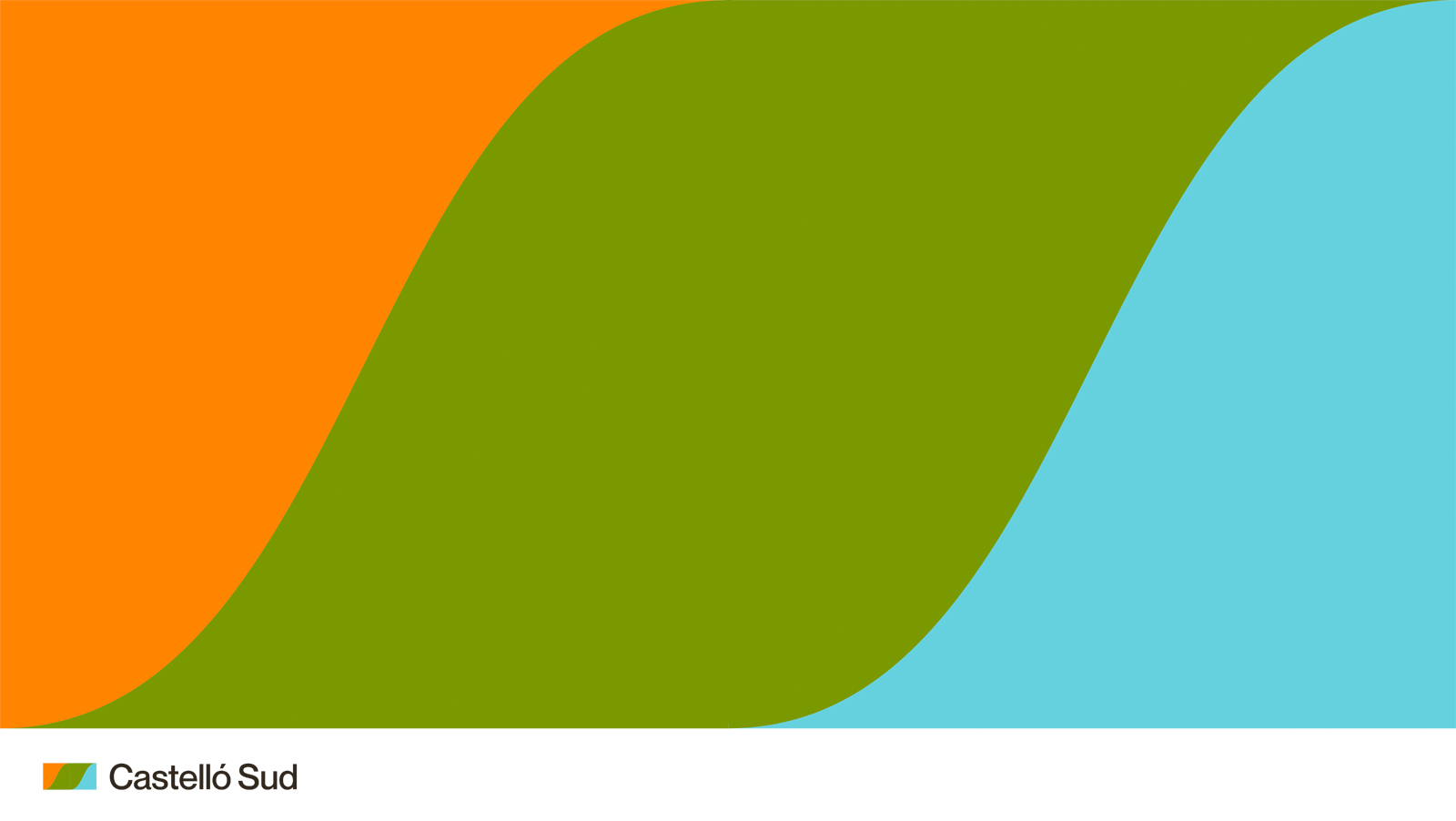
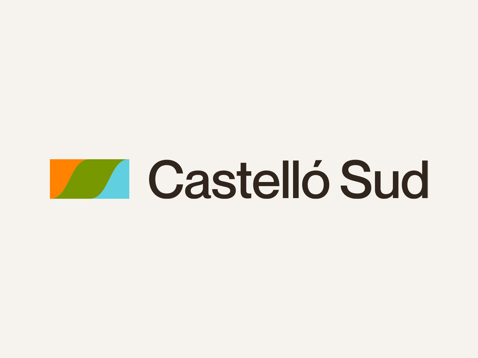
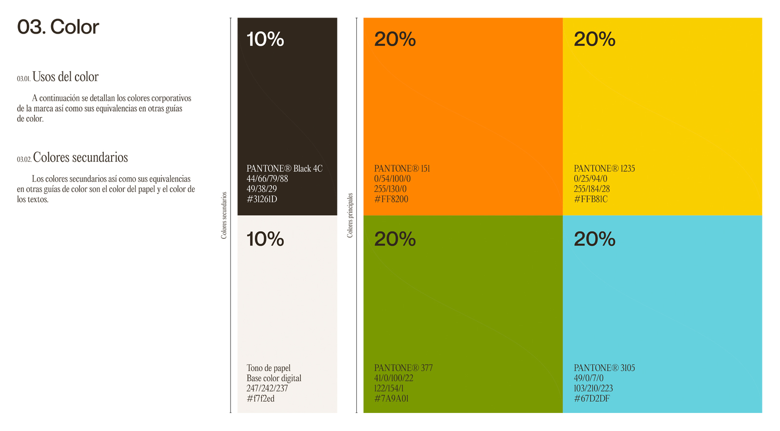
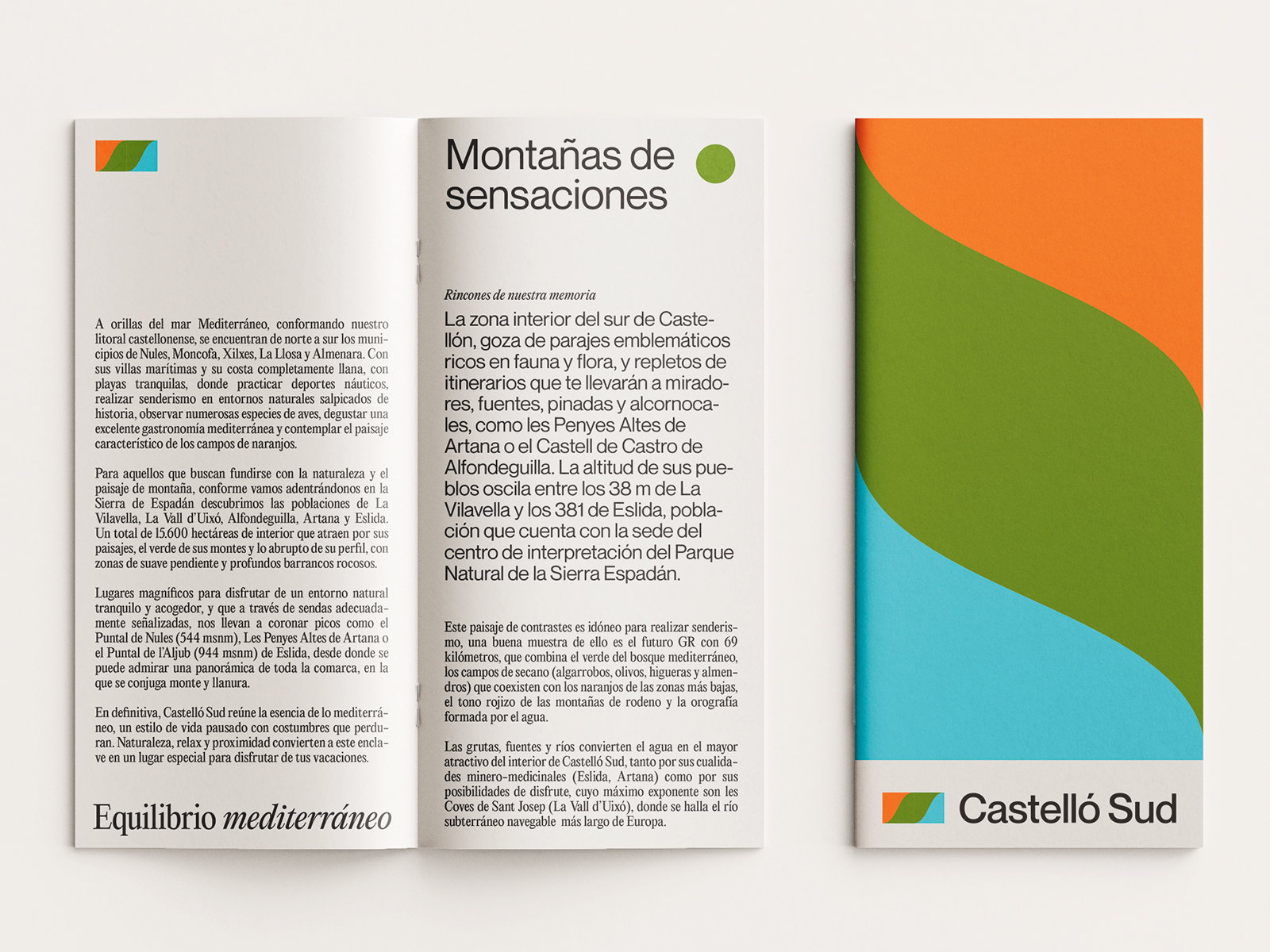
The simplification of the initials C of Castellón and S of south represents the rugged coastline of this area, while the colour sequence travels visually the orange colours of the interior architectural heritage, the green of the nature and the blue of the sea.
A retro aesthetic to reinforce the sustainable tourism concept. Back to basics, to usual tourism, without overcrowded and impersonal locations.
Year: 2021
Client: Consorcio Gestor del Pacto territorial por el Empleo de La Plana Baixa
Sector: Público
Direction: democràcia®
Art direction: Javier Tortosa
Design: Javier Tortosa
Skills: tourism, brand, color, retro, mindfulness, slowlife, color, logotype, beach, mountain, architecture, culture